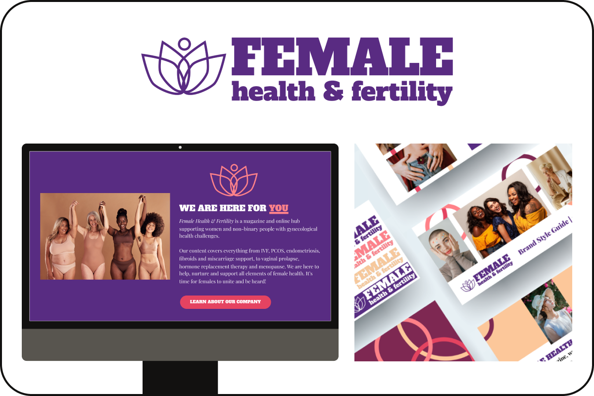
Lotus of fortune

How a responsive website broke barriers for women’s health

Role

UX Design Lead at Female Health & Fertility

Time

2022-2023

Tags

Branding, UX/UI, Accessibility, Health and wellness, B2C, Startups

Tools

Adobe Creative Suite, Figma, Canva, Google Workspace, Zoom

Female Health and Fertility website and branding snapshots

Let’s set the tone

Emily Ansell Elfer found me in a directory of disabled designers. She asked me to join a small, international team in the health and wellness industry. My role was building her brand from the ground up, including choosing the company name.

Emily has personal struggles with fertility. While researching, she noticed a lack of resources for women and non-binary folks who share her same hardships. This motivated her to be the change she wanted to see in the world.

Headshot of Emily Ansell Elfer
Emily Ansell Elfer, Founder and Editor-in-Chief at Female Health & Fertility

Missing the mark

I did a competitor analysis and noticed 2 main problems: lack of inclusion and poor user experience. Marginalized communities are misrepresented or left out entirely. Imagery was heteronormative and white. As users, Emily and I were frustrated with navigating their websites. It often took too long to reach our goal. The designs felt outdated and the tone of voice was too scientific or fun.

A bumpy road

After extensive research, I identified 4 user pain points:

  • Time — Working adults are juggling priorities and struggle to make room in their schedules for appointments.
  • Money — Many people can’t afford treatment and have a hard time securing the funds from insurance.
  • Lack of support — Health stigmas make it difficult to find a community of like-minded individuals.
  • Public unawareness — Taboo health problems cause women and non-binary people to be scared to talk with loved ones.

It’s all coming together

I collaborated with a developer to bring the website to life. We started with UX artifacts like a sitemap, user flow, low-fidelity and high-fidelity wireframes in Figma and Adobe Creative Suite. This allowed us to empathize with users and ensure their goals are being reached.

Homepage wireframe (left) and user flow (right)

The ultimate lookbook

I created a brand identity and style guide that’s modern, inclusive, accessible, informative, friendly, and comforting. It includes key elements like logos, color palette, typography, icons, imagery, and content writing.

Everyone is welcome

Inclusivity was top of mind for every design choice. From choosing women with body hair in the imagery to having an AA color contrast ratio for disabilities, representation is what matters most.

Another important business goal Emily had was designing a user interface that’s intuitive and easy to digest. Minimalism and white space reduced cognitive load of the content-heavy pages by allowing elements to stand out more.

Female health and fertility website on desktop, tablet, and mobile
Screens sizes desktop, tablet, and mobile

Lessons learned

If I had more time, here are the steps I’d take to improve the product:

  • User testing — A/B testing CTA buttons and sections can increase conversions rates. I’d flesh out different ideas and see what users connect with most.
  • App development — E-reading on the go is done best on an app. I’d propose to Emily to make her content accessible on mobile devices through iOS and Android applications.
  • Frequent critiques — We had bi-weekly critiques, but I’d suggest increasing the frequency to ensure one design idea didn’t go too far without feedback.

All hail queen Bria

Skip to content