BUILD-A-BADDIE
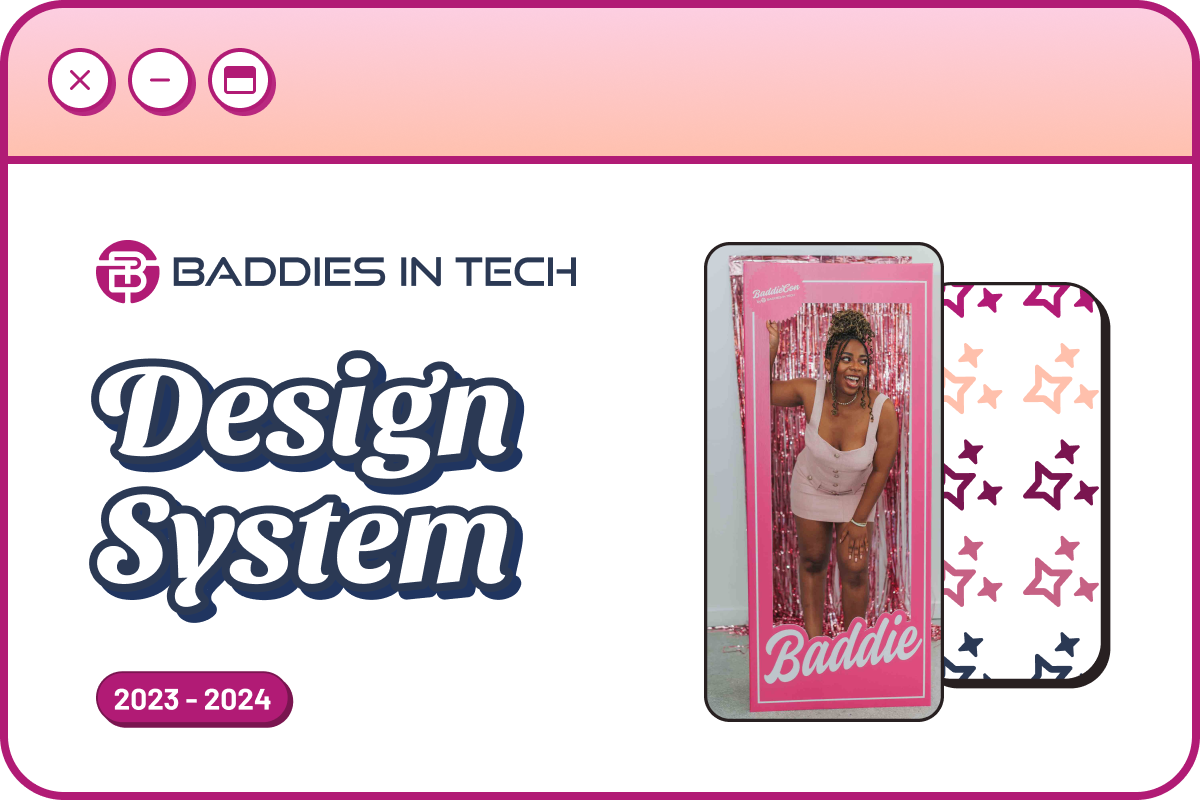
A Y2K design system for techies
RoleUX Design Lead and Copywriter at Baddies in TechTime2023-2024TagsDesign system, UX writing, Accessibility, Social goodToolsFigma, Notion, Jotform, Google Workspace, Zoom
The problem
Black, Latinx, and Native American women make up 5% of tech
Yes, you read that right the first time. Though society has made progress with fostering diversity, clearly, the problem still exists. If companies today are so focused on inclusion, why are women of color still underrepresented? Organizations like Baddies in Tech are working on combatting the lack of representation in STEM. Baddies in Tech’s mission is to double the representation of Black, Latin, and Native American (BLNA) women in tech roles to 10% by 2030.
Context
An alien and a Barbie walk into a conference
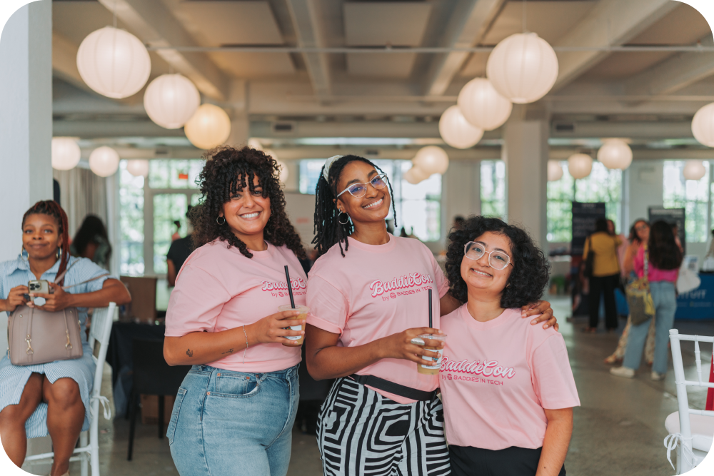
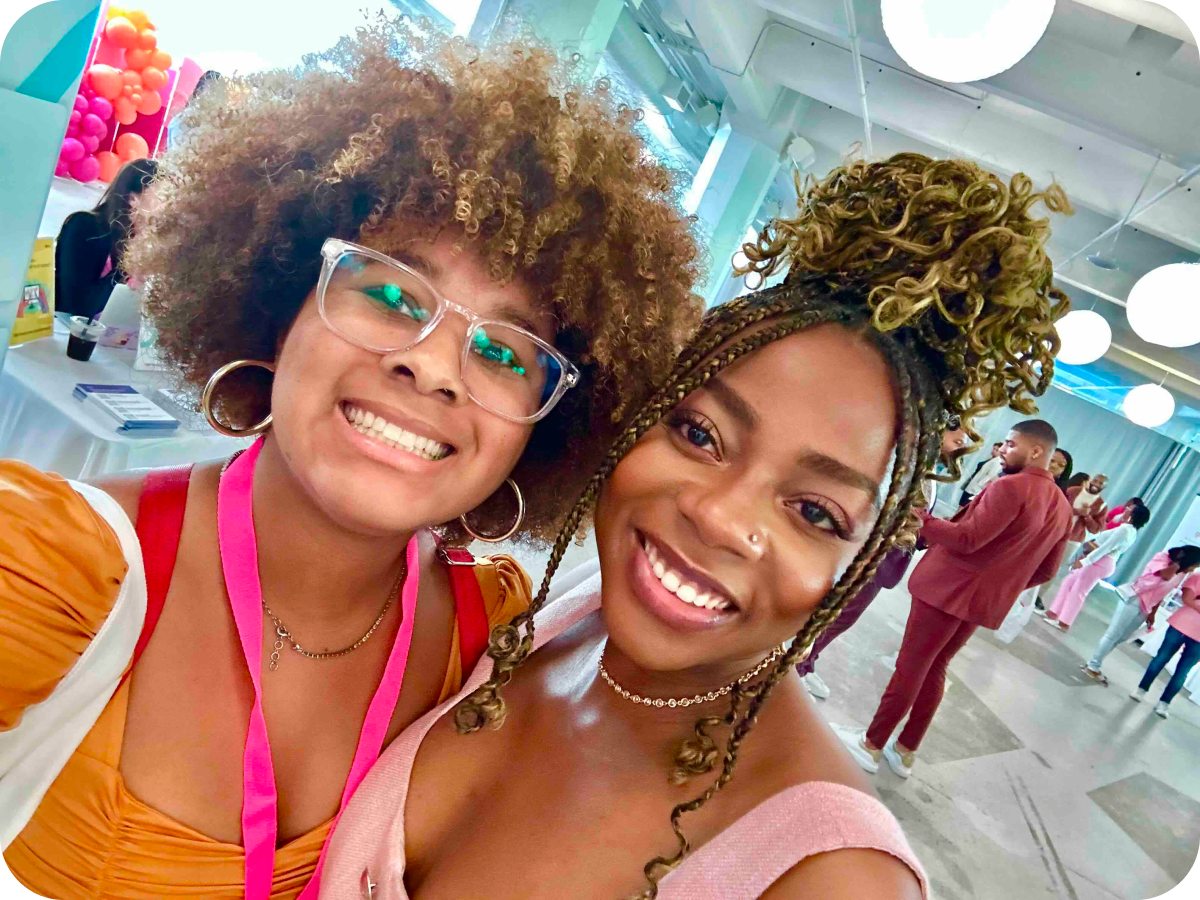
It all started at BaddieCon. Founder of Baddies in Tech, Allie Joy Tsahey, asked me to assist with a brand refresh project for her community-focused company. Branding is my forte and I value togetherness, so I knew this would be a fruitful collaboration.
The solution
I gave their brand a facelift
Admittedly, staying on task was hard during conference season and the holidays. We used Notion for project management. This was my 1st time using the platform in depth. There was a learning curve for me. Good thing Allie Joy is a great teacher! We outlined the project brief, timeline, deadlines, and metrics.

Research
Survey says…the struggle is real
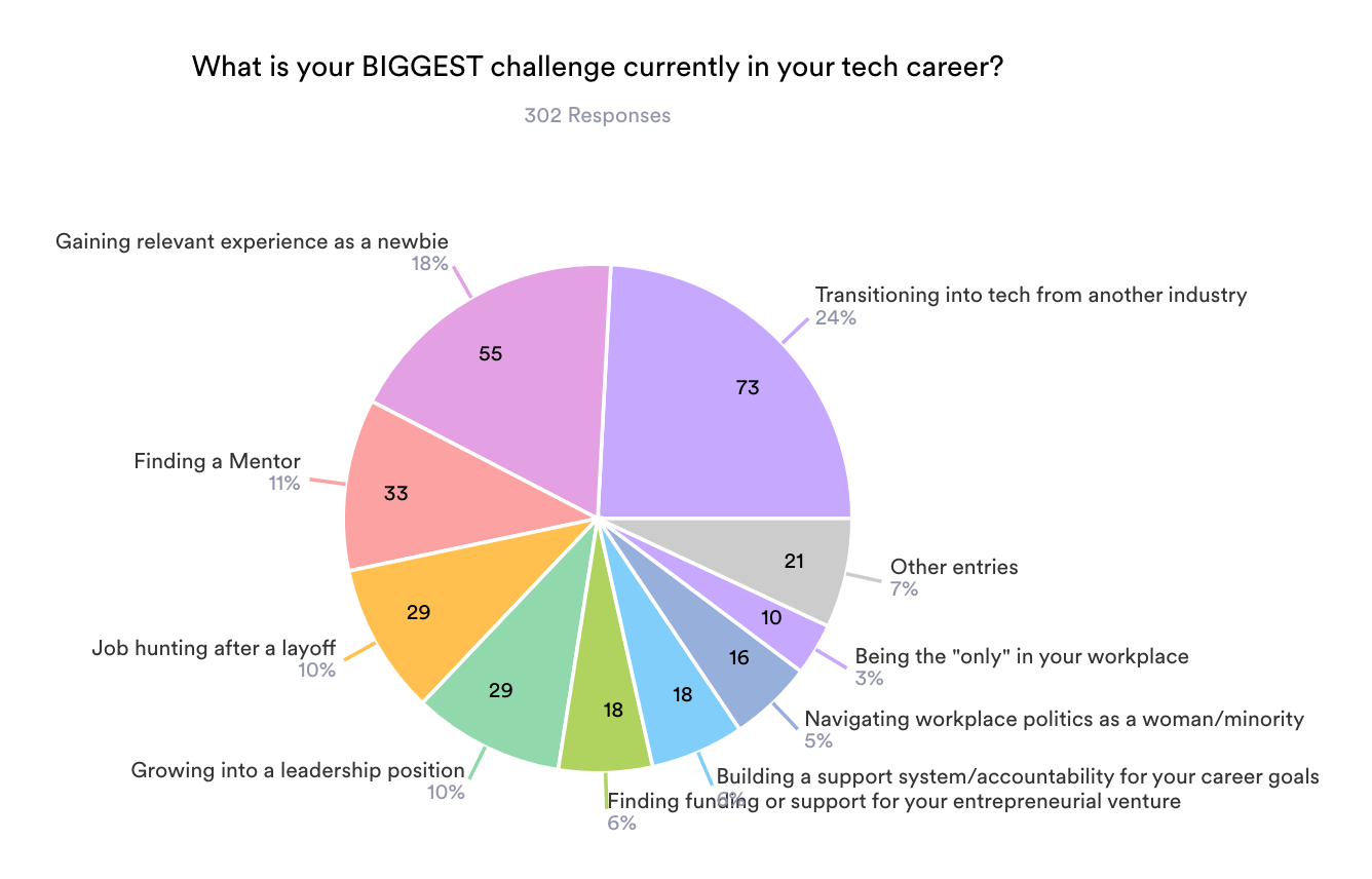
We sent out a survey completed by 302 users. Here are insights about most users:
- Educated women of color, age 18 – 44, based in the US.
- Challenges faced include being a tech newbie, finding mentorship, experiencing layoffs, and leadership.
- Joined Baddies in Tech to build community, find a job, and/or network.
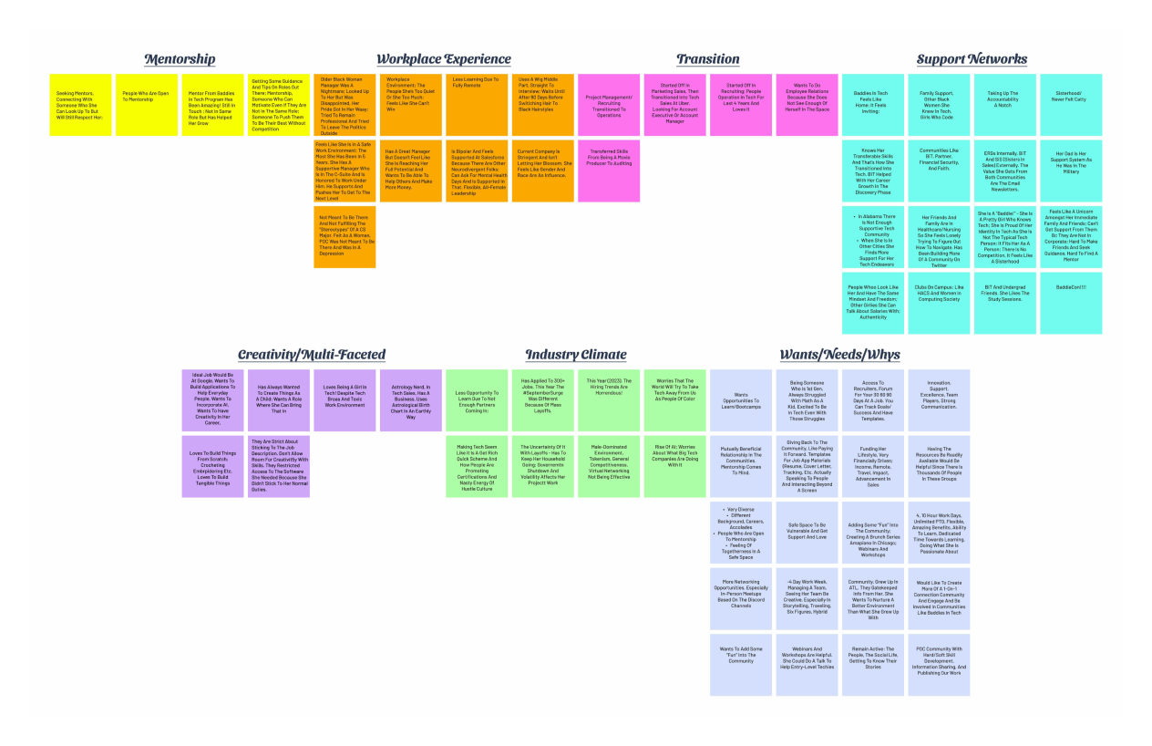
10 interviews + 72 insights
Picture this: 10 Zoom calls, each one a deep dive into the lived experiences of women of color navigating the tech industry. From micro-aggressions to mentorship gaps, the interviews painted a vivid picture of the unique hurdles these women face. But it wasn’t all doom and gloom—these conversations also revealed resilience, untapped potential, and a hunger for change.
Strategy
A new millennium
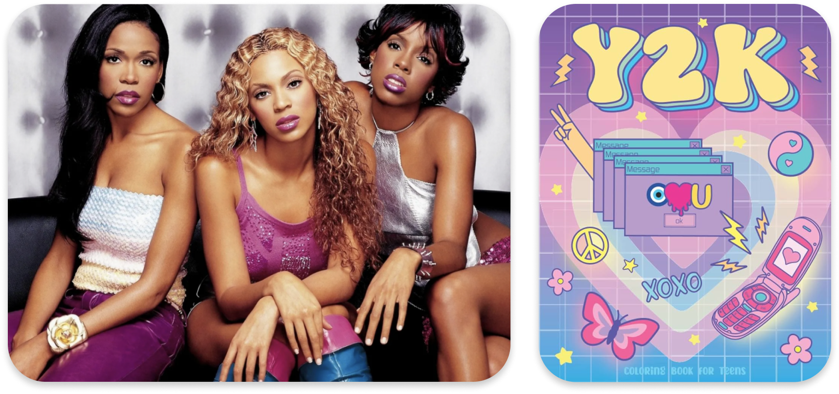
How might we help our users feel more supported and included in tech? The rapidly evolving tech industry brings anxiety. Nostalgia evokes feelings of comfort and familiarity. The Y2K era held core memories for the majority of our audience. I drew inspiration from Neo-brutalism, the perfect fusion of the early 2000’s and present day.
Design
New branding, who dis?
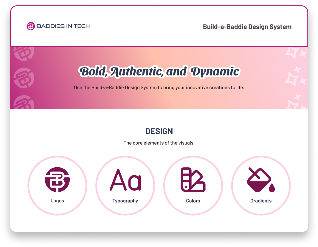
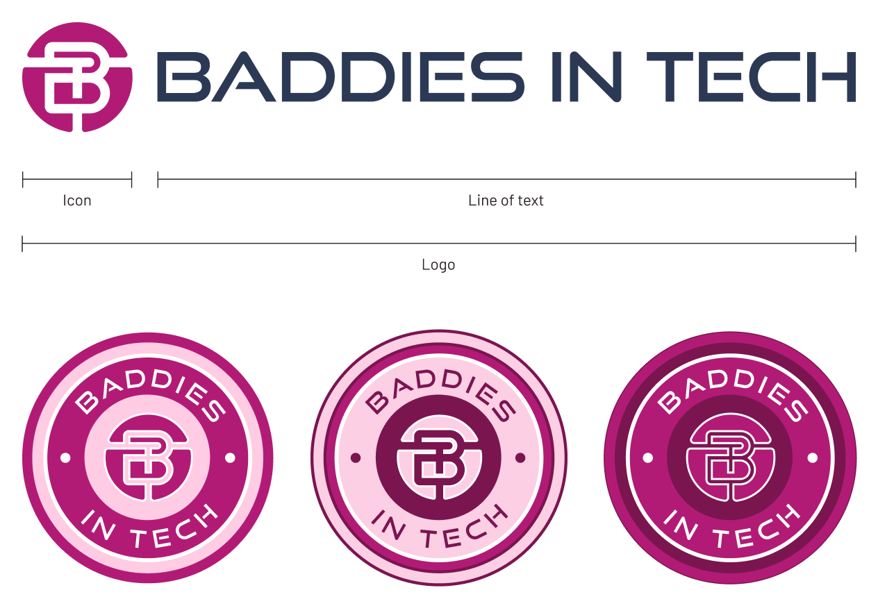
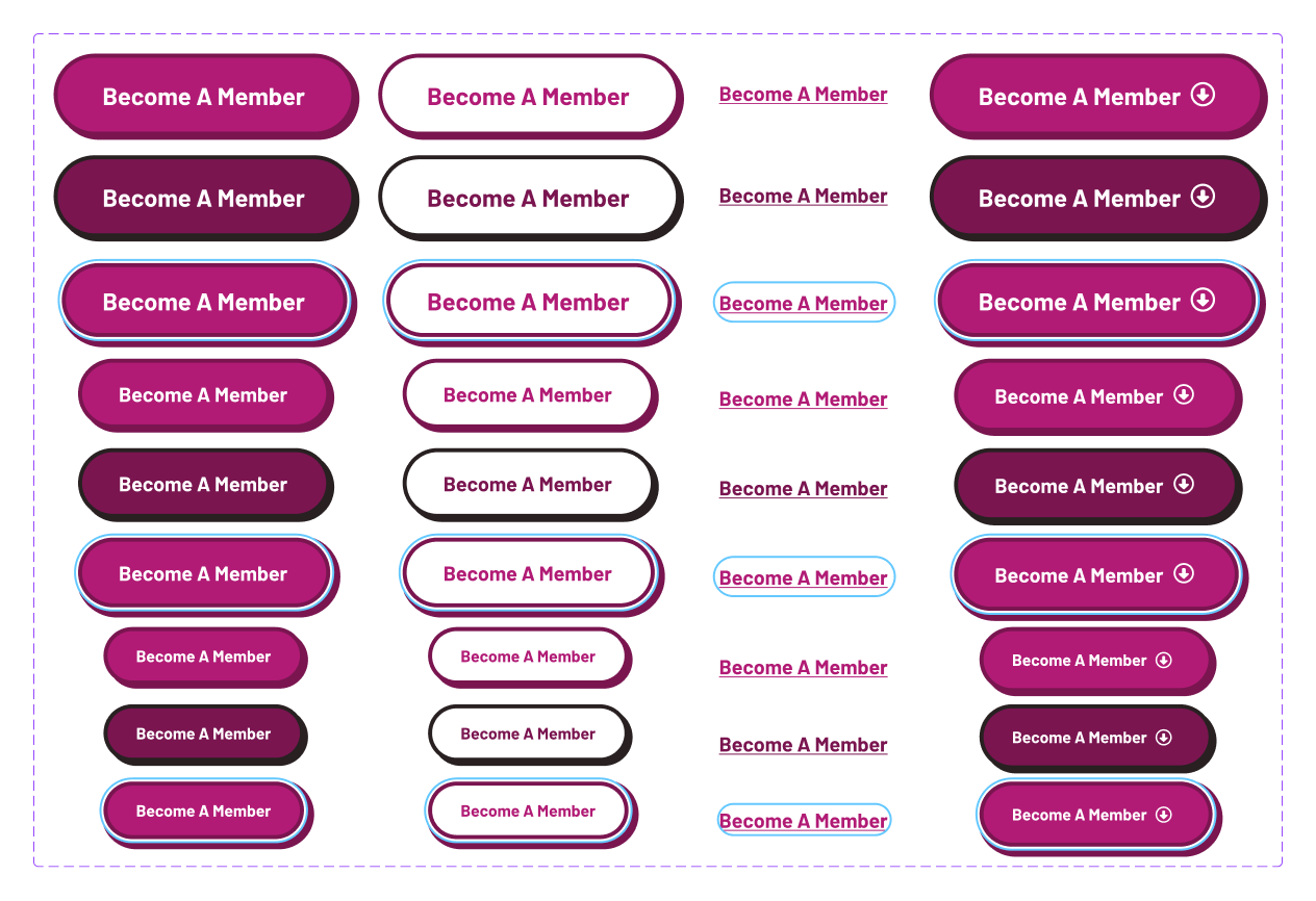
Building a design system that merges Y2K nostalgia with Neo-brutalist flair is all about embracing bold, contrasting elements while maintaining a user-friendly experience. I focused on creating reusable components that balance this aesthetic with usability, ensuring everything is fully responsive and accessible. This system gives us one source of truth to ensure consistency across assets.
Building blocks
Each component, whether it’s a button, card, or modal, was carefully crafted to be reusable, scalable, and consistent across the entire product ecosystem. I focused on making these components highly functional and visually cohesive, ensuring they work within a responsive grid and adapt fluidly to different devices and screen sizes. By adhering to a consistent style guide and design tokens, I ensure that every component not only looks great but also enhances usability and accessibility.
Communication is key
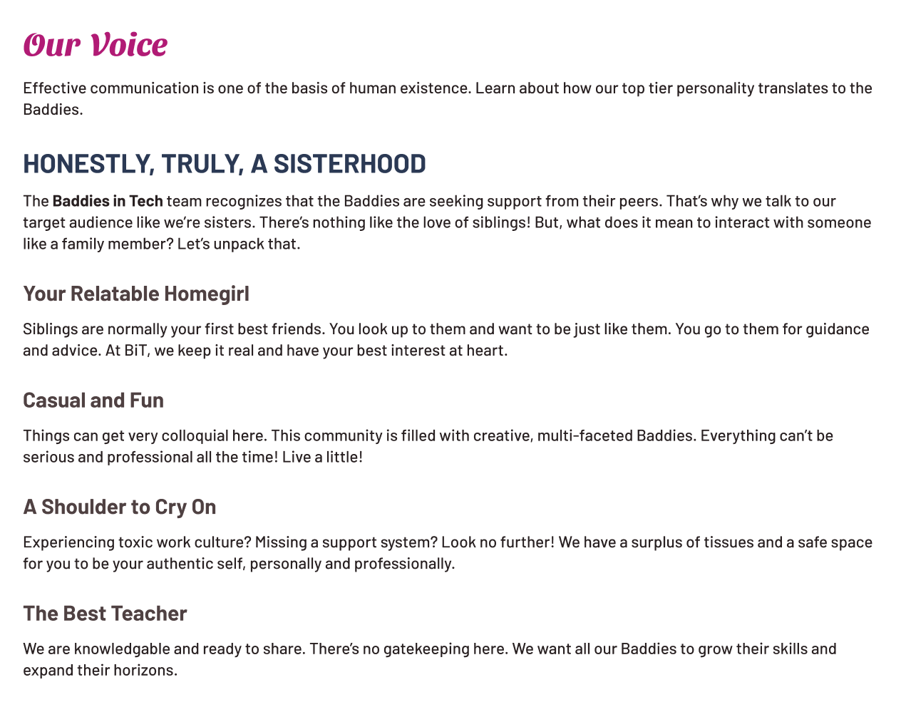
Creating content writing guidelines is all about establishing a consistent voice and tone that resonates with users while ensuring clarity and accessibility. I began by defining the brand’s personality—whether it’s playful, professional, or empathetic—and setting rules around how that translates into everyday copy. I also incorporated best practices for readability, such as using plain language, avoiding jargon, and prioritizing inclusivity.
Hopes and dreams
- Increase website (free membership tier) conversion rate to 20%.
- Convert 30% of free members to the paid membership tier.
- Reduce website bounce rate.
- CSAT Score of at least 8 out of 10.
All hail queen Bria
Bria is an exceptionally talented and detail-oriented Design Copywriter. During our time together at Baddies in Tech, she consistently exceeded expectations, making significant contributions to several key initiatives, including the branding of our website, the Women’s Rights Buildathon, and our first annual BaddieCon! Her ability to capture the unique voice of a brand is truly remarkable. Bria consistently demonstrated a strong work ethic, streamlining workflows, providing insightful feedback, and delivering high-quality work within tight deadlines. Her supportive nature and willingness to share resources with newer team members fostered a collaborative and growth-oriented environment.
Darlyze CalixteDirector of Technology, Baddies in Tech